Hello everyone; I hope you had good holidays and a great new year!
We have been making a lot of progress since our last blog, so there is a lot to talk about! Hope you like it! ![]() .
.
New Galaxy Editor
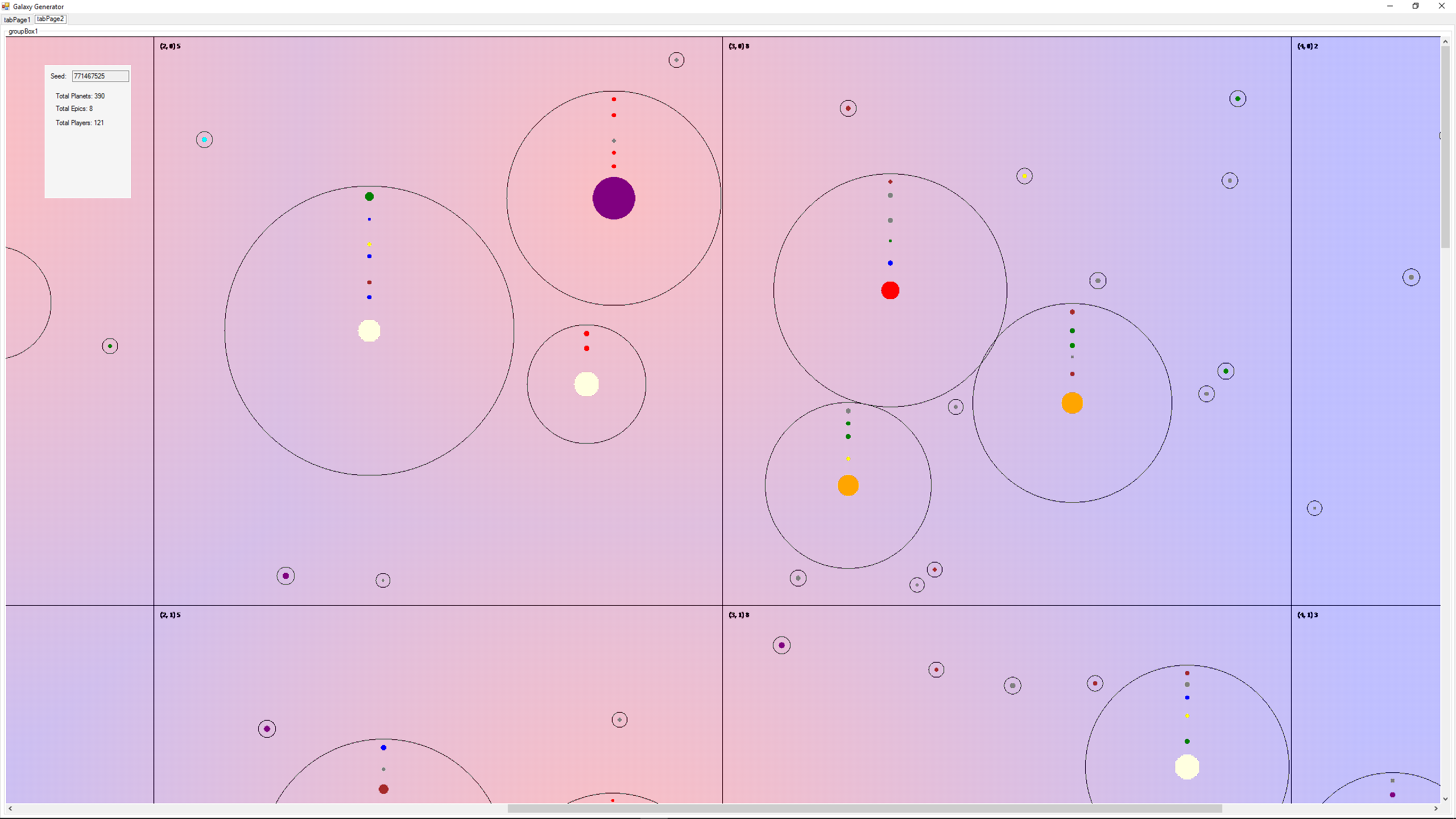
Probably the best but arguably not the most important update to the game is the brand new Galaxy Editor. This tool helps us populate the galaxy with interesting and unique environments that the players will create their empires in. It randomly generates a base universe just like the old one but now it can be edited after generation to create more interesting galaxies. In the future this will be used to design both PVP arenas and quest instances. We’ll also be adding in the ability to load an existing galaxy or map back into the editor to make future tweaks.
Stars are created first and there is a wide variety of stars types and sizes. On one end are the cool and small Brown Dwarves and the other end of the spectrum has super hot purple giants. In between is everything that you would expect and a few of our own creations.
The heat output of stars is very important for the next step of galaxy generation - the creation of planets. Each type of planet, such as Terran or Ice, has a certain temperature range in which it can exist. Earth for example is a Terran planet. Terran planets have very specific needs. They need to be close enough to a star for it to receive enough warmth to have liquid water, but not be hot enough to just turn into a molten ball of badness.
Every point in the galaxy has a specific temperature. This is calculated by checking the heat output of all stars and modifying it by the heat decay from travelling through space. This can mean that while a single star doesn’t provide enough heat for a specific type of planet to spawn, neighbouring stars might add just enough heat to allow for them to spawn anyway. In the future this will be used to determine environmental effects on planets and alliance projects which build dyson spheres around stars can freeze over planets; ocean planets might become ice, terran and magma planets might become rocky given enough time.
Rogue planets have been added to the generator which are isolated planets belonging to no solar systems and do not orbit any celestial object. Celestial objects can be any size within a range as opposed to the hardcoded 5 sizes we had before. The epic versions of non-jovian planets are dramatically larger than their non-epic counterparts. We’ll be adding colonizable moons, binary and ternary star systems, small celestial objects orbiting epics, and asteroid belts which cause damage to units within them soon.
The old solar system generation is gone. Now the galaxy is split up into massive quadrants which may contain many to no solar systems. No long does the galaxy feel boxy based on the constraints of solar system grids. Likewise, the number of players which spawn in a quadrant can be more or less than the hardcoded 3 of the old generator. I’ve personally seen the generation portion spawn anywhere from 1 to 9 players in a quadrant.
Multi-threading and Optimizations
It’s crazy to think that it’s been 14 years since multithreading became standard in home computers and the vast majority of games still don’t make use of it or underutilized it in those which do. The client now automatically chooses what the optimal amount of threads should be for users who don’t understand multithreading but users still also be able to tweak the amount of threads being used from the ini file and eventually the in-game settings. This greatly improves game performance, especially during large scale combat. This is an option that will benefit the game a lot in the long run, since we can let more things happen at the same time, without having it impact performance in a big way.
We have also been able to optimize our Unity scripts a lot, which has also yielded in a 20-60 FPS increase on most systems.
Together, these two changes have made the game a much smoother experience, with faster UI’s, better unit response times, etc.
Unit Icons
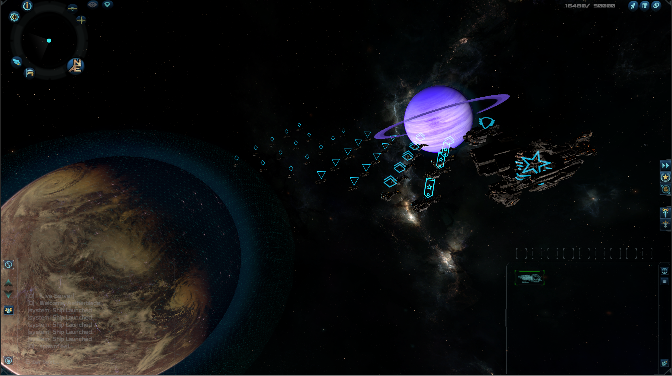
Another new feature we have added to the game, though it’s still being worked on, is unit icons. These new icons will appear over ships, currently depicting just the type of ship (such as Corvette, Destroyer, etc.) but eventually it will be a symbol you can choose during ship design, so you can easily see what ships are which by looking at them.
This is an option that is currently just on or off, but we are also working on a distance based display. This means that when you get close enough to your ships, the symbols will not show, getting further away (or into Tactical Zoom) will make them pop-up for you.
Better UI’s
As said before, the UI’s respond a lot better now because of the optimizations, but there have been more improvements made to them as well.
We added “press enter to continue” to most UI’s. This means for example, pressing enter after typing in your password, will log you in, after naming a ship design, it will will ask you if you want to save it (pressing enter again will confirm that). It may be a small quality of life feature, but it saves a lot of time, compared to having to always click.
- We added “press enter to continue” to most UI’s. This means for example, pressing enter after typing in your password, will log you in, after naming a ship design, it will will ask you if you want to save it (pressing enter again will confirm that). It may be a small quality of life feature, but it saves a lot of time, compared to having to always click.
-
The Shipyard has also been improved in several ways. You can now log out, and continue production after you log back in, without having to re-order the ships you want.
-
Another Shipyard improvement is the ability to give quicker build orders. The system we used before checked if you had all the requirements to proceed with construction before you could give your next build order. This check could take a second or longer which may be considered too slow for some people. Now the ship is placed in the queue while it is being checked so you can continue queueing more ships up without having to wait.
-
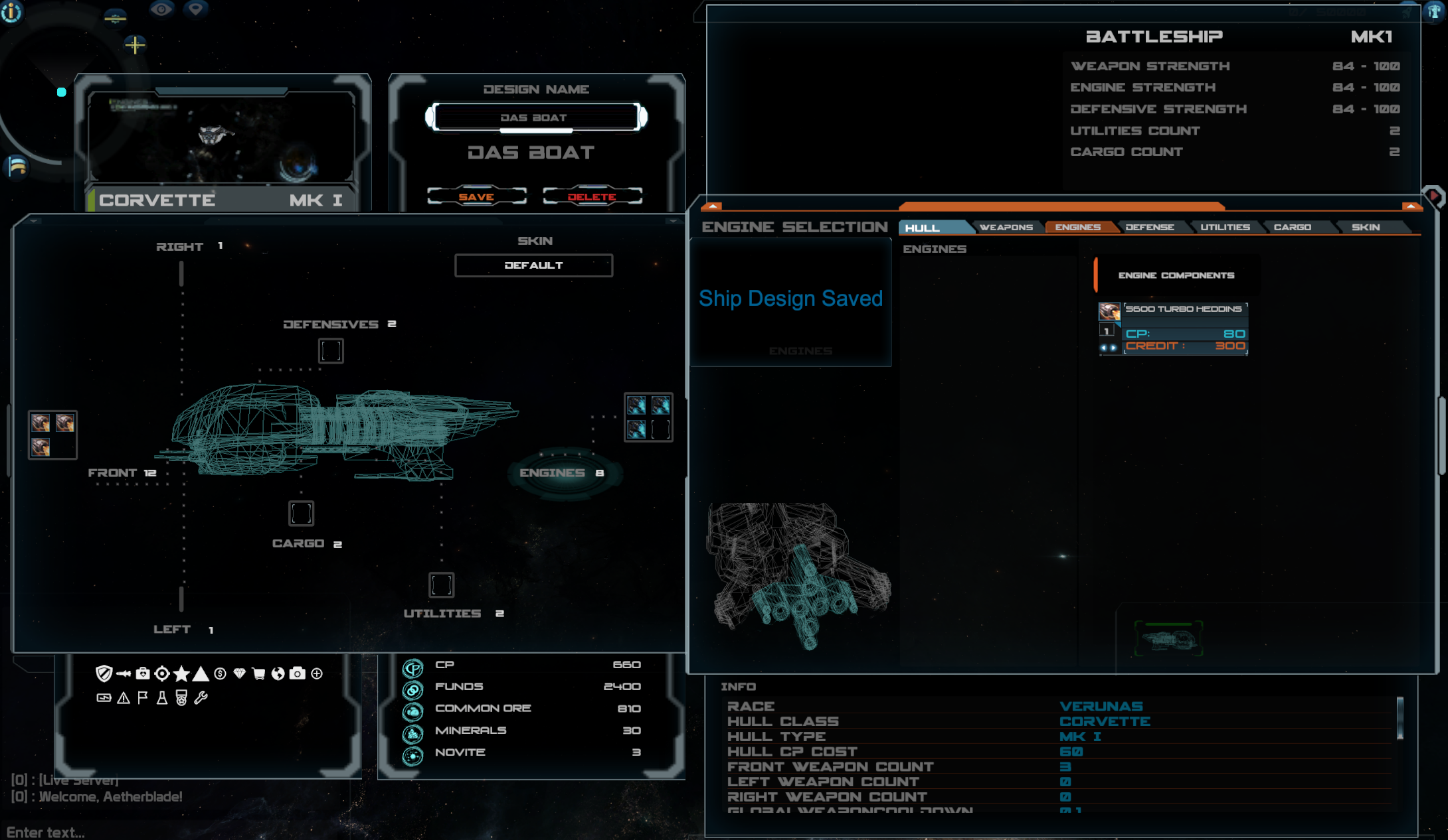
The save and delete design buttons in the Ship Designer have been moved to underneath the name textbox. This makes them easier to find and use.
-
The Ship Designer now also has a pop-up when you save as confirmation that it was successfully saved for you.
-
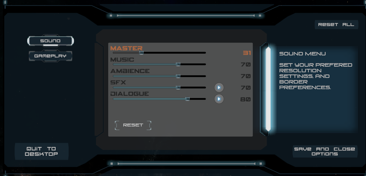
The Options Menu now has its button’s revamped making them easier to understand and use quickly.
Ownership colors and hover-overs
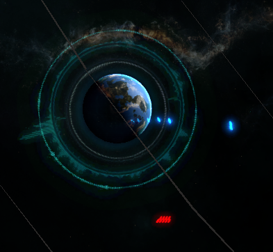
Ships and planets now have colored outlines depending on ownership, which is especially useful in Tactical Zoom. Your own units are green, while enemies are red and neutrals yellow for example. These colours can be tweaked by players in the options menu or ini.
Another useful new feature is that when you hover over a planet while in tactical zoom, it will show you information about that planet, such as ownership, ID and location.

